How Ergonomics and Accessibility Power Better Retail Tech
Most people don’t think of software as something you feel.
But in a fast-paced retail environment, where every scan, tap, and screen matters, how software works physically is just as important as what it does.
That’s why at FieldStack, we think beyond features. We think about people — the people holding the devices, tapping the screens, moving through aisles, and interacting with customers. Our approach to ergonomics and accessibility is deeply informed by firsthand retail experience and a commitment to designing tools that work for real humans in the real world.
Here’s how we do it.
Rooted in Real-World Retail Experience
One thing that sets our team apart is that many of us come from retail backgrounds. We've worked behind registers. We've stocked shelves. We've been in warehouses, at the customer service desk, and on the sales floor.
Because of that, we're always asking questions like:
- Which side of the register does the scanner sit on?
- Can a clerk complete a task without looking away from a customer?
- What happens when someone with less tech confidence picks up this device?
- Can someone with limited dexterity or low vision still use this effectively?
As Chad Verrill, our VP of Product, put it:
“We’re not just building software — we’re building something that fits into physical workflows. That means thinking about devices, hand positions, screen sizes, and how people actually interact with the tools we give them.”
Ergonomics by Design, Not Afterthought
Like ergonomics is to humans using devices, user experience design is to humans interacting with software on devices — it's about efficiency, accuracy, and speed. When we design interfaces, we pay close attention to where key actions are placed and how they're accessed.
A User Experience Designer is a problem solver. Anything that involves people interacting with devices is a problem for the User Experience Designer to solve using known standards, user experience testing, iteration, and retesting. Our team designs many scenarios to see which ones feel better for users given their unique psychology and interaction habits and select the ones that perform the best.
For example:
- Touch targets are designed to be large and tappable, especially on mobile devices.
- High-frequency actions (like completing a sale or confirming an inventory count) are located in easy-to-reach areas — usually the lower right corner, where the thumb often rests.
- Feedback messages pop up above where a user is tapping so their finger doesn’t block important info.

It might sound small, but those micro-interactions save time, reduce errors, and make the experience more intuitive. Over a full shift, that adds up.
Built for Different People, Different Stores, and Different Setups
No two retail environments are the same — and neither are the people working in them.
We work with retailers who sell everything from music to pet food to shoes. Some stores are small and packed with inventory. Others are expansive warehouses with heavy lifting and long-distance picking. And our users span a wide range of ages, tech familiarity, and physical abilities.
That diversity informs everything we do.
We think about:
- Form factors: mobile vs. desktop, touch vs. mouse, keyboard vs. scanner
- Physical setups: counter height, register placement, and aisle space
- Workforce diversity: vision, dexterity, preferences, and digital fluency
We also design with real-world safety in mind. Clients with warehouses have unique demands on their workforce — with team members driving forklifts, carrying box cutters, moving pallets, etc. In those situations, clear visuals, large tap targets, and easy-to-read prompts aren’t just convenient — they’re essential for safety, efficiency, and confidence on the job.
“We realized early on that what works for one vertical might not work for another,” Chad explained. “So we design with flexibility and inclusivity in mind. Different retailers, different users, same powerful tools.”

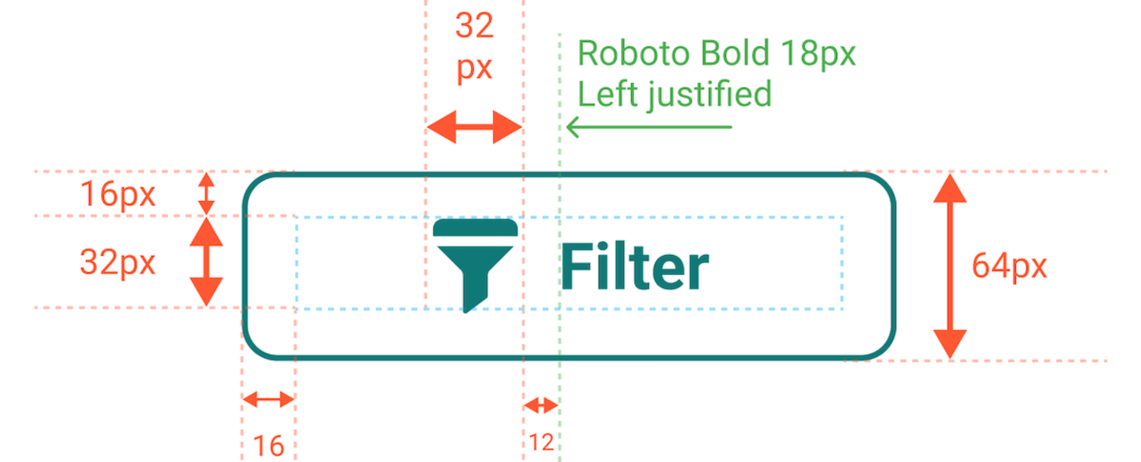
Above: An example of a button in our design system. This design helps define each part of the software for brand consistency across verticals.
When Feedback Shapes the Interface
One example of this thinking in action came from feedback we received from a long-time Maine-based client, Renys. Their team noted that the original POS interface wasn’t ideal for some of their store associates — the buttons were too small, and certain screens weren’t intuitive for users with low vision.
Rather than chalking it up to a one-off issue, we used that input to inform a refresh of our POS interface. We updated the layout, increased contrast and font sizes, and improved the overall flow. The result was a cleaner, more readable interface that worked better for everyone — not just one store.
We also took what we learned from that project and applied it across other parts of the platform.

Above: An overview of our Reskin Project Flow. This helped the Product Team track software connections and allowed the Development Team to visualize interconnectivity.
Accessibility Isn’t Optional — It’s Core to Our Design
Accessibility isn’t something we tack on later. It’s been part of our design philosophy from the beginning – and it’s something we continue to improve as we go.
That includes:
- High-contrast visuals for users with low vision or color blindness
- Keyboard-friendly navigation for non-touch workflows
- Clear, readable typography and logical flow
We’ve even trained staff on accessibility compliance to ensure we’re building tools that support all users — from store clerks to regional managers. And we align closely with WCAG standards to help bridge online and in-store experiences.
“As our clients’ workforces grew more diverse, we had to grow with them,” Chad said. “That includes designing for different levels of eyesight, dexterity, and technical confidence.”
It All Comes Down to Empathy and Experience
Designing for ergonomics and accessibility isn’t about chasing trends — it’s about understanding the real-life challenges of retail teams and building software that supports them.
And it’s a continuous process. As retail changes, so do the needs of those working within it. We're always listening, testing, iterating, and evolving.
If you want to dig deeper into how our team approaches product development from a people-first perspective, we’ve written more about it here:
👉 A Look Inside the Process Behind FieldStack’s Retail Tech Innovation